We always want to offer our customers software that is not only technically but also visually state-of-the-art. That’s why we decided to give the user interface of our time tracking and expense software a makeover.
The inviting interface is intended to provide a positive view of everyday tasks. Of course, we do not make any compromises in terms of functionalities. These will be retained in their entirety and can also be found in the same place in the new look to make the switch easier. The interface is now even more intuitive and easier to use, so you can reach what is important to you more comfortably and quickly.
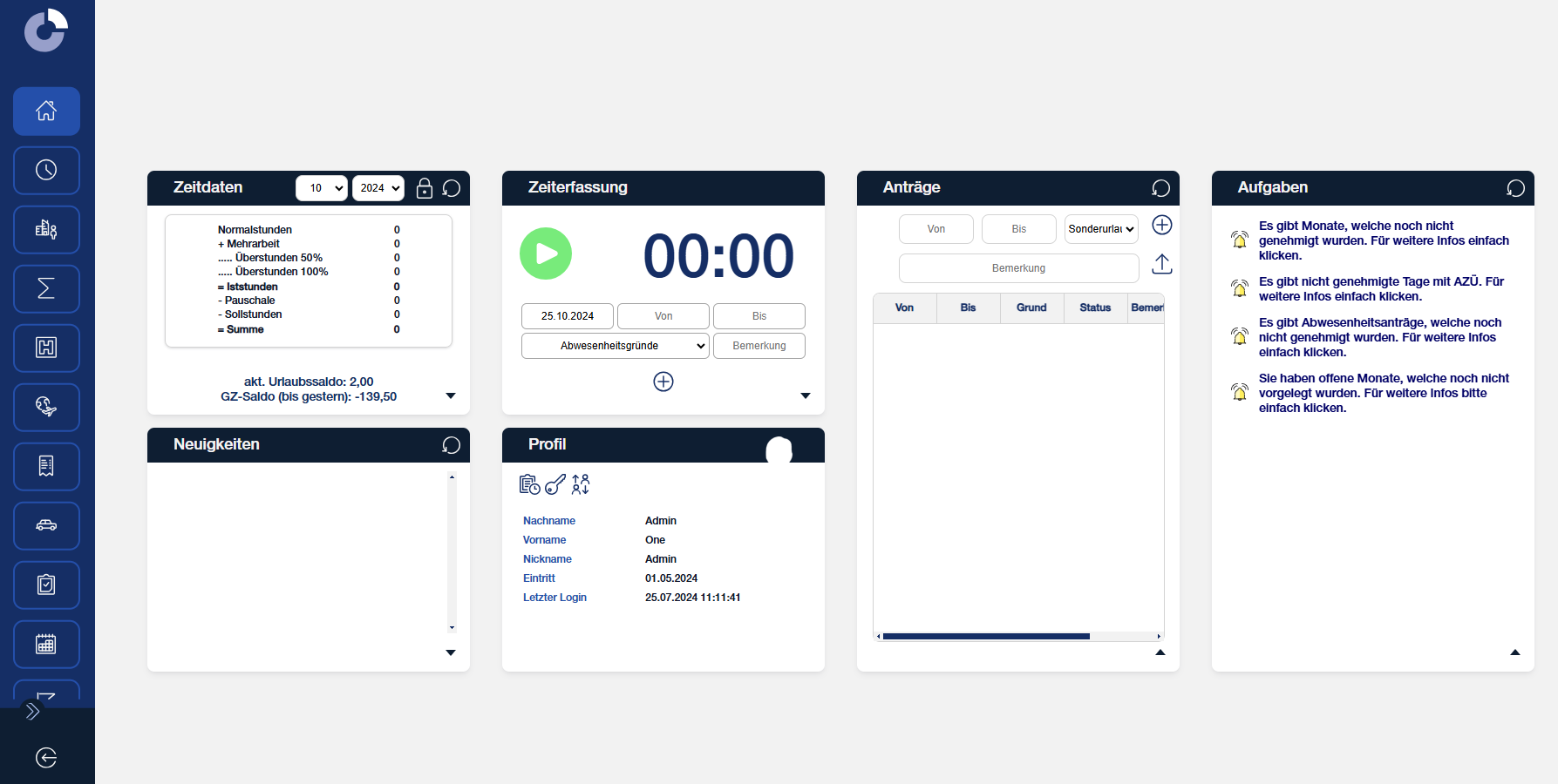
The tidy start page not only looks beautiful, but now also offers the possibility to move and arrange widgets individually and flexibly. In addition, these can be expanded if necessary, so that all information is visible at a glance.
We have taken the feedback of our customers seriously and have also changed the positioning of the menu bar. Instead of showing and hiding it at the bottom, it is now a fixed but discreet part on the left edge. However, you decide for yourself how present the menu bar should be by selecting whether the menu items should be displayed with or without a label.
The most important information in a nutshell:
- Bright and bold colours
- Flexible Widgets
- Improved menu bar
- All functions will be retained
You don’t want to wait any longer and start a new era with Coredat? Just contact helpdesk@coredat.com by email! Our consultants will be happy to support you in coordinating the changeover to the new design!